
Artwork
We are Historically Informed Performance nerds (you knew that by now). But did you know that nearly all the artwork you see on our website also has historical significance?
Our main logo was created by painstakingly harvesting the Italian script on the title page of the first edition copy of Vivaldi’s L’Estro Armonico. From that, we built our own new, very old, font and logo:
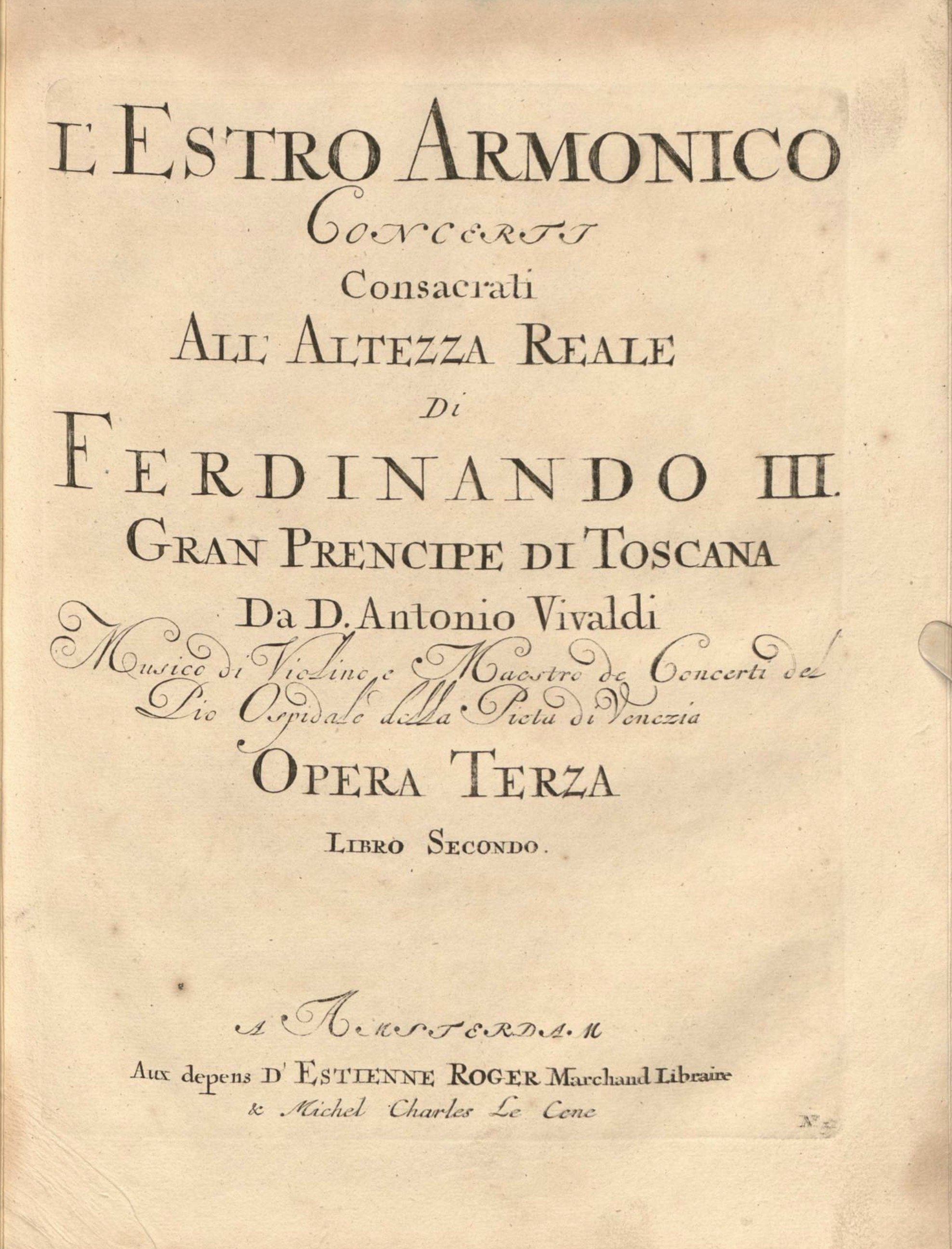
We chose to adapt the elegant script just beneath Vivaldi’s name for L’Armonia Boston’s logo.
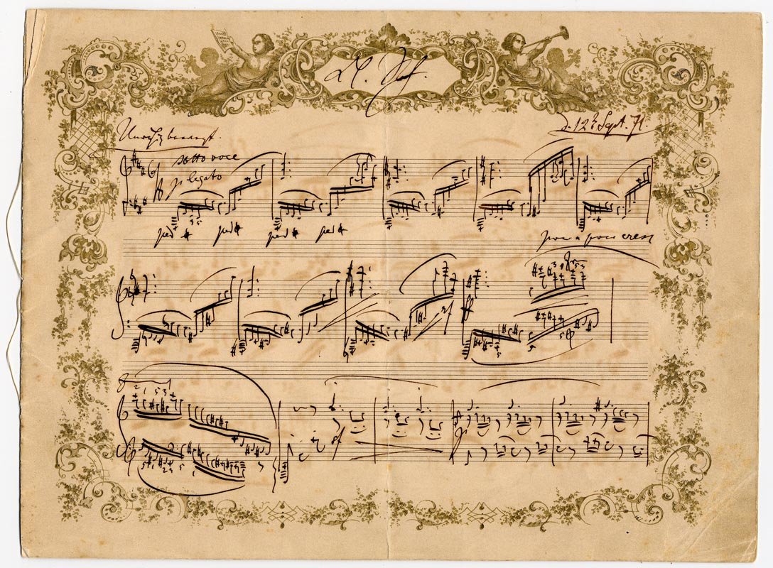
Johannes Brahms - Capriccio, Op. 76, No. 1. Manuscript, 1871
https://musiclib-exhibits.library.yale.edu/exhibits/schumann/brahms_capriccio_op_76_no_1.html
The Footer design and merchandising incorporates the unique and historic original wallpapers of our organization’s home Gore Place:
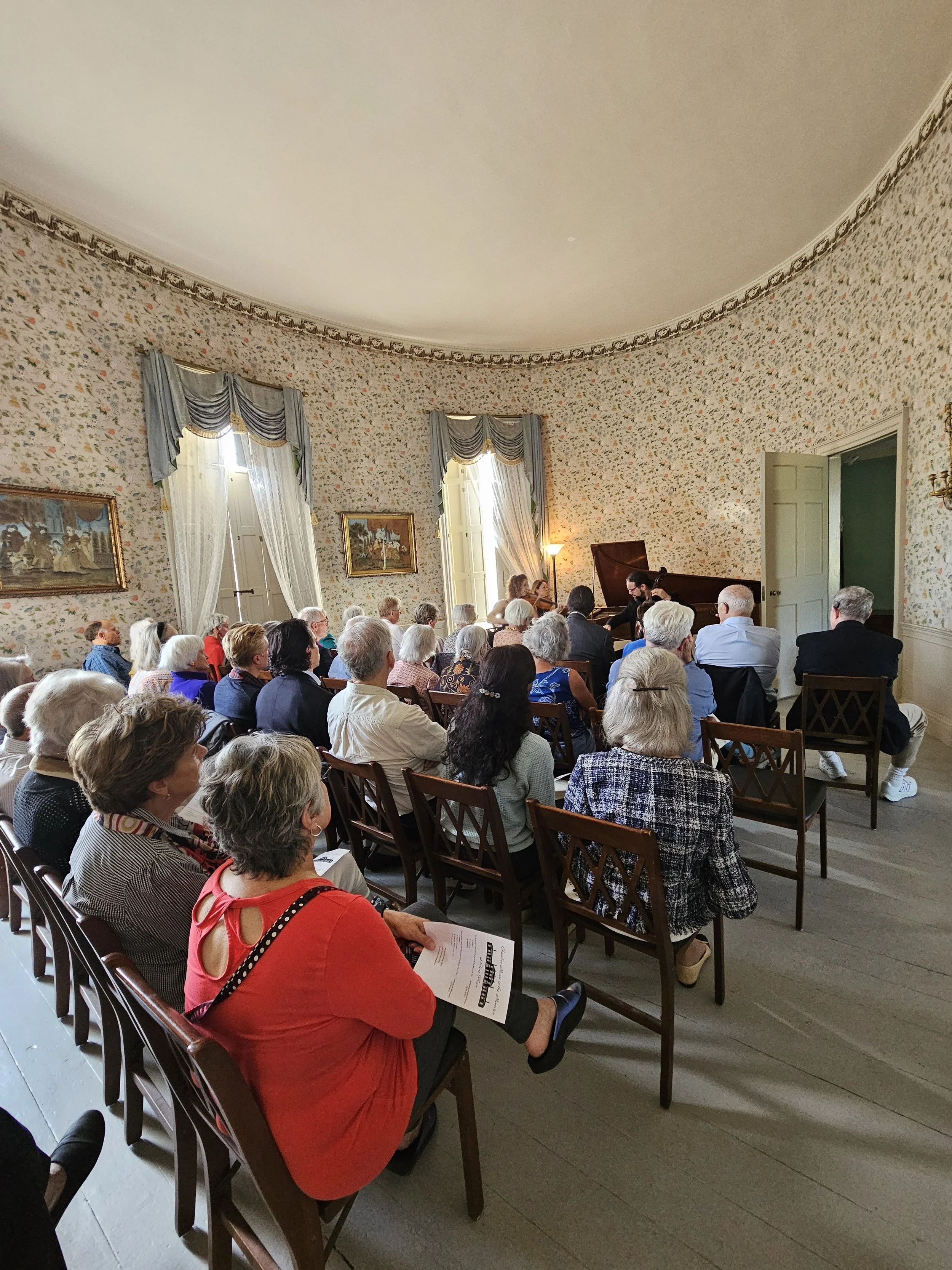
The ‘Withdrawing Room’ in Gore Place with its sunny, floral wallpaper
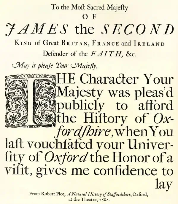
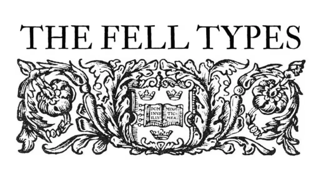
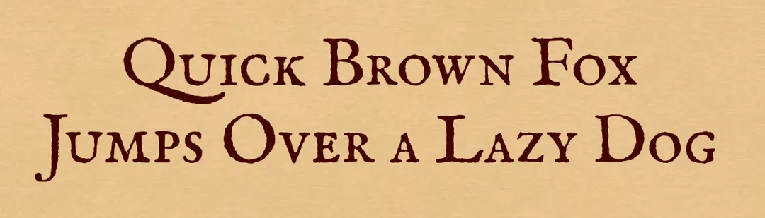
Our website font is IM Fell English, fittingly created in the 17th century by English Bishop John Fell (left) at Oxford University Press. It is one of the earliest examples of a University press standardizing its type. It was revitalized & digitized by Igino Marini in 2004:

We said nearly all the website art has historical significance. If you purchased anything from our shop or made a tax-deductible donation, then you met our Labrador mascot (L’Armonia Boston → L’AB → Labrador… playing early instruments). He has no historical significance. We just love dogs.
